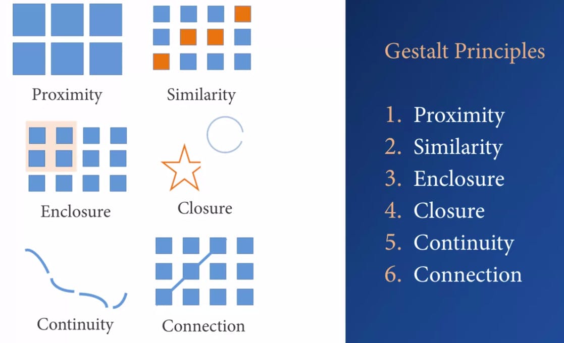
Maybe you don't know, but you are using one or more Gestalt principle while you are building you data viz. The principle is related directly with the Cognitive load and Clutter.
The Cognitive load is the amount of mental effort required to interpret information, so for data visualisation we need to learn how to minimize the cognitive load, you can read the theory here. The Clutter we can understand like something that we know when we see it, so Clutter to data visualisation is all the things you remove while still preserving key ideas, less clutter is equal more effective visualisations. Reduce clutter to minimize user's cognitive load.

Let take a look inside all of them:
- Proximity is when we perceive objects as a group when they are close together.
- Similarity is when we naturally connect things that took alike as being part of the group.
- Enclosure uses color or boundaries to highlight or contrast information, it's another way to depict group.
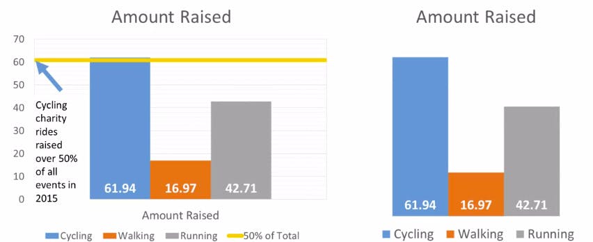
Closure is the mind's ability to fill in gaps, users must have enough essential information to be able to fill the gaps. Like image below, the bar graph works without any axis because the bars are aligned on the bottom.
Continuity, in the chart below that no need for an axis because the bars are line up on the bottom.
Connection, normally a line chart where things are related to one-another.
