


Clear your thoughts to start, this post resume a bit what I learned with Springboard and Google in the path to be a Data Analyst.
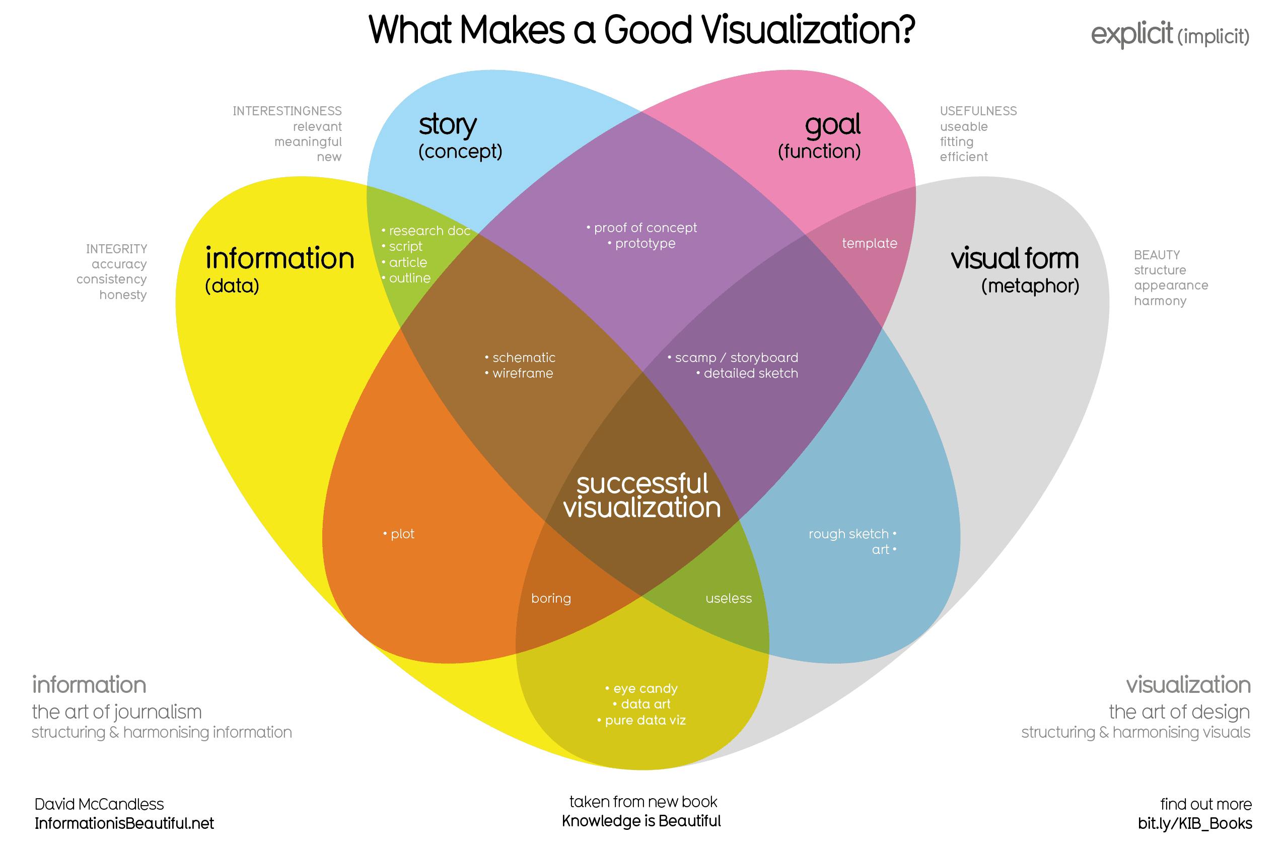
The McCandless Method is the start to know what you will build and consist in four concept:
- Information: the data you are working with
- Story: a clear and compelling narrative or concept
- Goal: a specific objective or function for the visual
- Visual form: an effective use of metaphor or visual expression
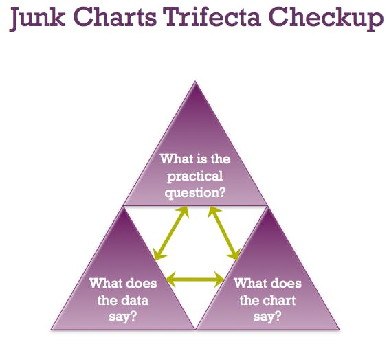
Kaiser Fung’s Junk Charts Trifecta Checkup it's the approach that is a useful set of questions that can help consumers of data visualization critique what they are consuming and determine how effective it is. The Checkup has three questions:
- What is the practical question?
- What does the data say?
- What does the visual say?
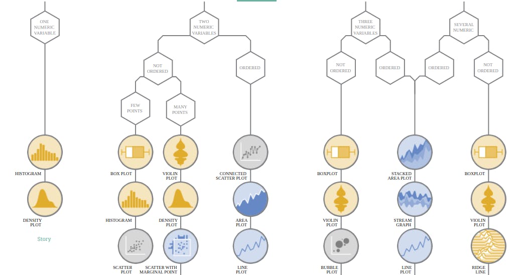
The chart to choose is something that always concern. Choose the right one to express the data to answer a question.
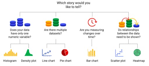
Use a decision tree to choose a visualization. Here you can check the dataviz that you need.
To finalize, the 9 principles of design:
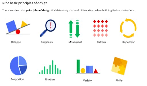
1. Balance: The design of a data visualization is balanced when the key visual elements, like color and shape, are distributed evenly. This doesn’t mean that you need complete symmetry, but your visualization shouldn’t have one side distracting from the other.
2. Emphasis: Your data visualization should have a focal point, so that your audience knows where to concentrate. In other words, your visualizations should emphasize the most important data so that users recognize it first. Using color and value is one effective way to make this happen.
3. Movement: Movement can refer to the path the viewer’s eye travels as they look at a data visualization, or literal movement created by animations. Movement in data visualization should mimic the way people usually read. You can use lines and colors to pull the viewer’s attention across the page.
4. Pattern: You can use similar shapes and colors to create patterns in your data visualization. This can be useful in a lot of different ways. For example, you can use patterns to highlight similarities between different data sets, or break up a pattern with a unique shape, color, or line to create more emphasis.
5. Repetition: Repeating chart types, shapes, or colors adds to the effectiveness of your visualization. Think about the book sales chart from the previous example: the repetition of the colors helps the audience understand that there are distinct sets of data. You may notice this repetition in all of the examples we have reviewed so far.
6. Proportion: Proportion is another way that you can demonstrate the importance of certain data. Using various colors and sizes helps demonstrate that you are calling attention to a specific visual over others.
7. Rhythm: This refers to creating a sense of movement or flow in your visualization. Rhythm is closely tied to the movement principle. If your finished design doesn’t successfully create a flow, you might want to rearrange some of the elements to improve the rhythm.
8. Variety: Your visualizations should have some variety in the chart types, lines, shapes, colors, and values you use. Variety keeps the audience engaged. But it is good to find balance since too much variety can confuse people. The variety you include should make your dashboards and other visualizations feel interesting and unified.
9. Unity: The last principle is unity. This means that your final data visualization should be cohesive. If the visual is disjointed or not well organized, it will be confusing and overwhelming.