


Have some principles to follow to design a Dashboard or Report that must be follow when we present the data for others.
Good Data Visualization Should Be Boring, how say Myles in his article at 2015, the data viz is to be understood not to prove that you are an artist: "the purpose of visualization is to most effectively represent that data so that it can be understood by the audience both most quickly and easily."
Know your public, that will help you to focus on the goal to bring the solution/answer for the question that are been made for the data. We don't need to add a lot of chart's on the Dashboard, we need to know how to answer using simplicity, less is more. Visual encoding translates data into a “visual vocabulary and language” that the human brain is naturally good at perceiving and interpreting.
Key points:
- Bar chart the Y axis start with 0, always.
- Counter intuitive, if your data have label on the axis, probably you don't need axis title, maybe even the axis.
- Using image, make the size proportional. The size must represent the value.
- If you have a lot of categories in time series data the Trellis plot is better approach.
- Avoiding Pie-chart when there are 5 or more categories that are to be compared. Too many categories to compare is best perceived in a bar graph visualization.
- For the most part, you basically never want to use a 3D chart.
- Line length is a “pop-out” effect (pre-attentive attribute) that the human brain can quickly process.
- If you have two measures, your first instinct should be a scatterplot.
- When you are presenting to a large, live meeting you should not use a table.
- Humans have developed perceptual and cognitive capabilities that initially tend to favor speed.
- Data in a visualization must always be sorted based on the importance of the category of the data.
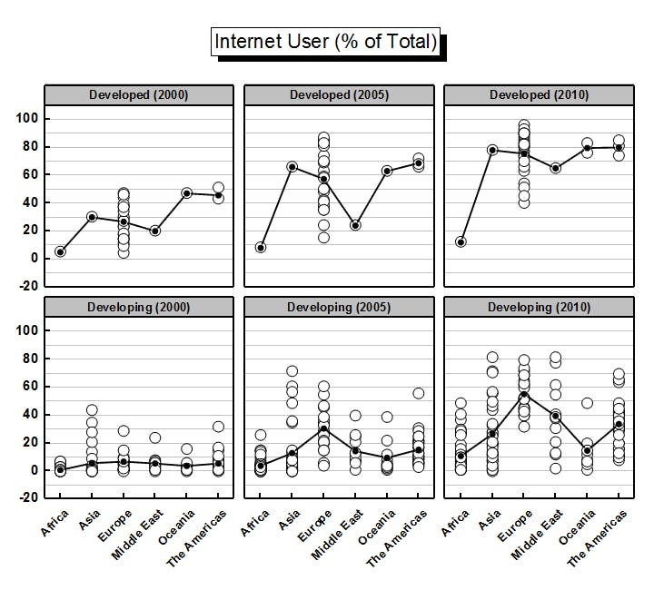 Trellis plot